by Tony Joshie
There is no denying that the Coronavirus, COVID-19, the pandemic is well and truly spreading rapidly in all countries around the world. Tracking the spread of the virus to know how it is impacting the world, in general, has suddenly become the duty of every concerned human being.
Contents
The spread of COVID-19 has affected the lives of everyone across the globe. Some because they contacted the virus and others because of imposed lockdowns to keep them from contacting the virus too. Knowing where and how to get reliable information to track the pandemic has become very important. As a result, there are now several dashboards, apps, and maps that provide detailed information about the spread.
If you are one of the many concerned individuals looking to get current news about the virus, we have compiled a number of reputed sources for you. The sources included on this list are only the ones that cover the world as a whole. Each of these dashboards and maps provide up to date information using sourced data from true sources.
QUICK NOTE: Because of the heavy lifting being done by analytics providers, many unscrupulous elements have turned to use the pandemic to their advantage. Hackers now use coronavirus maps to infect your computer. It is very important now that you are careful so as to avoid spreading fake news as well as infecting your computer with malware. Do well to only use dashboards provided by WHO or other reputed organizations.
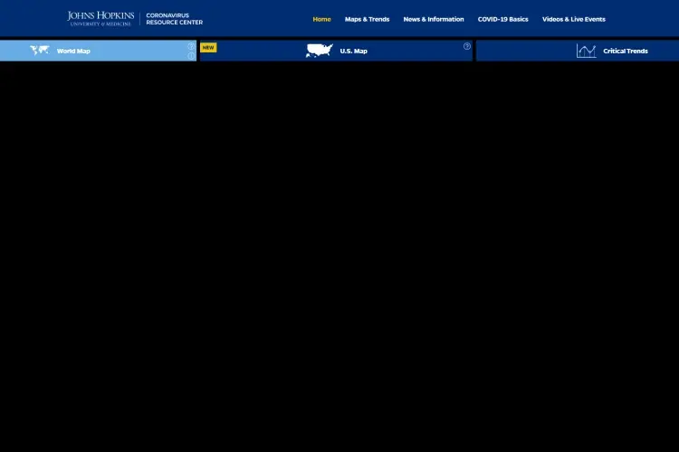
This is one of the best resources when it comes to mapping the spread of the virus. Created by the above-mentioned university, it was launched on January 22, 2023.
The dashboard accurately displays the location and number of confirmed cases as soon as they are discovered. A detailed showing of the number of recoveries, as well as deaths, is boldly displayed. To get specific information about your location, you only need to zoom in on the location and scroll through the different regions.
Asides from zooming in on a location, you can also click on a red dot to know how many cases have been confirmed in a country. The red dot also shows the number of cases in each state in the country.
The dashboard not only keeps the general public informed as new development unfolds, but it also gives health authorities and researchers detailed information.
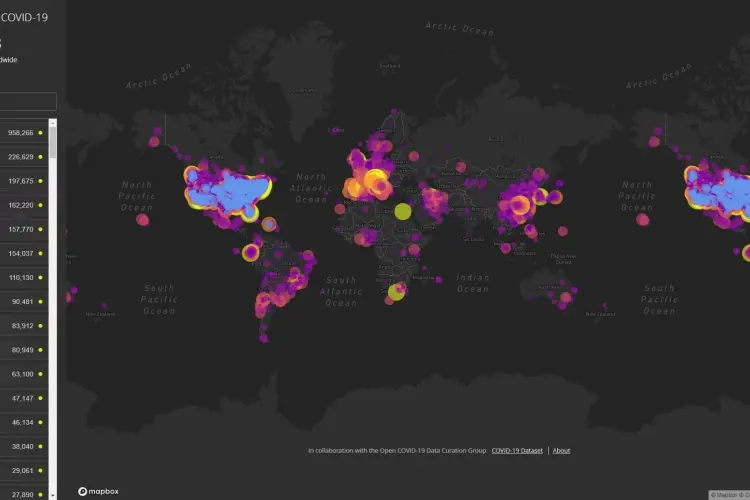
There is nothing against being informed in an attractive funny way right? HealthMap has, by far, the most visually pleasant and attractive animated map. For one, the map is in dark colors with countries written in small grey colors. Each country has dots representing that there are coronavirus cases in the country. The color and size of the dots depending on the number of cases discovered. For some countries, it is small and for some countries it is big. Then each dot has different colors o represent how fatal the coronavirus cases have been in those countries.
Healthmap pulls all its displayed data from multiple reliable sources. With this, it allows you to animate how the virus spread until it reached your country.
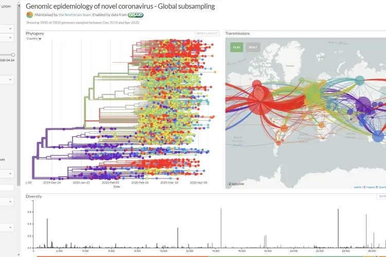
NextStrain is not your regular information map. This is because it displays information about the spread of the virus is a very dramatic fashion and in technical ways. However, while this can be pretty technical, it also makes the map very informative.
Logging on to the site, you will find a breakdown of the virus's genome as well as an animated map that shows the spread of the virus across the world. The map does not only show the spread of the virus, but it also shows, in an animated manner, the different routes the virus got to each infected country.
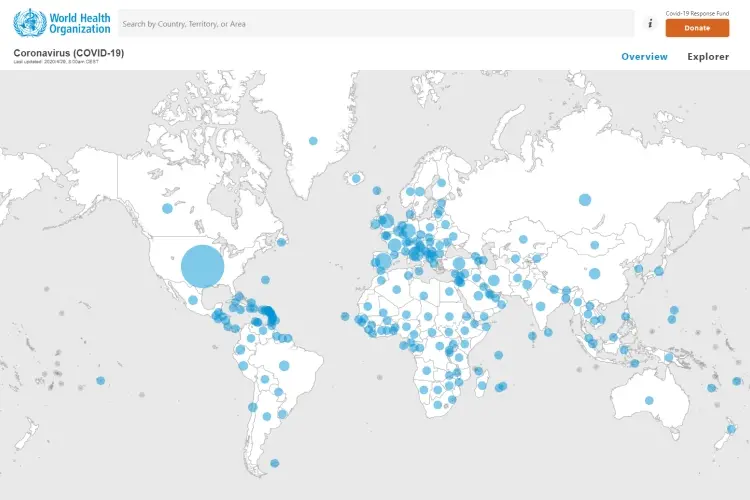
And of course, there is the dashboard created by the World Health Organization. In truth, many of the organizations mentioned above also pull their data from the sources of the World Health Organization. This makes a lot of sense considering the World Health Organization plays a huge role in making sure every human being in the world lives a healthy life.
The dashboard is very simple and provides an overview look at the spread of the virus. It shows the number of confirmed cases and increases as more cases are confirmed. It also shows the exact number of people that have died to the virus. It even shows the number of areas and countries with Covid-19 cases.
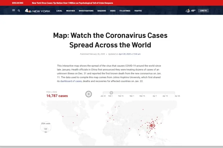
NBC needs no introduction right? Well, their international map for the coronavirus needs some.
The fact that every analyst and news organization are trying as best as possible to get credible information about the virus out to the public in no news. The NBC, NY, is not left out in the trend of passing information to the public.
One thing you should keep in mind about the map on the site NBC, New York site is that it is only updated every 24 Hrs. This means that checking it now means you are seeing accurate information about the spread of the virus as of yesterday. Asides this, the map is a very good resource. It is not as attractive or even dramatic-looking as some of the maps and dashboards already mentioned above. It is a simple looking map that shows all the areas that have been infected by the virus.
NOTE: if you are color impaired and do not find it easy looking at the information displayed on the John Hopkins University map, this map is your best way to stay current.
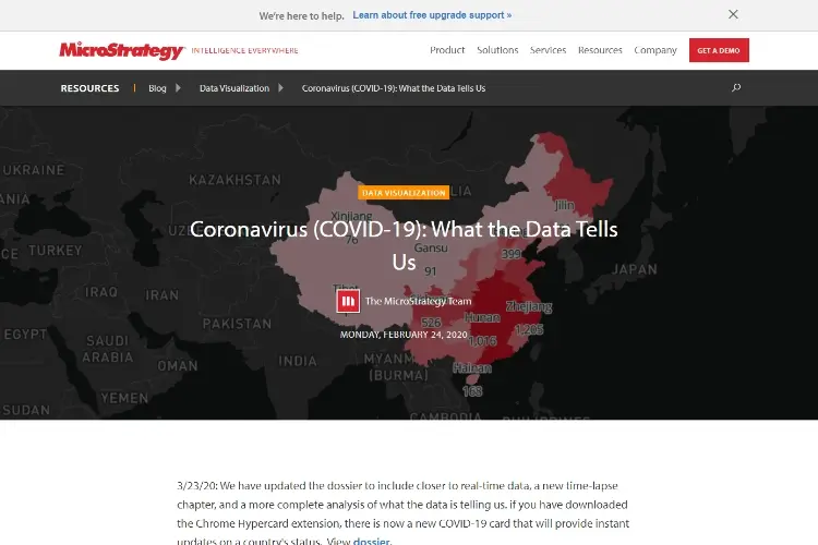
This is one of the best interactive sources to get up-to-date information about the virus. MicroStrategy does not have a lot of sources. In fact, it only pulls its data from those provided by John Hopkins University.
With daily updates to keep the map updated, It has everything you need to get informed. For instance, the dossier lets you see COVID-19 outbreak statistics of a particular day in a specific country. It lets you see the number of Covid-19 deaths according to time and geography it occurred. The dossier also lets you see how many people have the virus and how many of them have recovered from it.
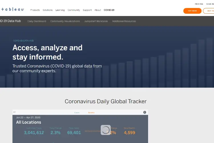
To be honest, this resource hub deserves to be a lot higher on this list. It extracts its data from three credible sources - Johns Hopkins, World Health Organization, and Nextstrain. The dashboard not only shows the number of cases, deaths, daily cases, and other related information about the virus, it also gives you access to the collection of other maps and tracker about the virus. The dashboard shows the daily cases confirmed all over the world as well as a map representation of the total cases in the world.
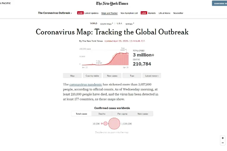
The New York Times Dashboard is a good way to stay informed without the use of any dramatic diagrams or colors. In fact, it is the best non-map source you can visit to get current information about the virus and its spread.
The dashboard displays easy to read charts that are accurate. It also displays descriptive text stats that gives you an idea of the situation the world is in because of the coronavirus.
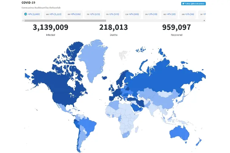
The Domo Covid-19 tracker is quite creative and accurate. Its data is sourced from the W.H.O and Johns Hopkins University. It also receives data from the CDC. All the sourced data are then curated and displayed on their website.
It shows a basic dashboard of the number of confirmed cases in the world and the number of recovered cases. Then quick scroll down will show you a detailed map of the spread of the virus spread by country and continent.
Besides being a good information source, the site also lets you embed its tracker on other websites.
Last on the list is a website owned by a concerned individual. He runs the site on his own and the site is updated about 4-6 times a day. Like most of the other maps, the site also displays countries infected with the virus in red colors. The website also shows an overview of the number of countries infected and the total number of infected, recovered, and dead people.
NOTE: The map is not as detailed as the other maps on this list. It is, however, a good source to get an overview of the virus spread.
While there are other good sources out there, the above mentioned are 100 percent credible. As earlier stated, the best and most cited resource map about the COVID-19 spread is the one created by Johns Hopkins University. Asides from the updates the maps continually receive, it is one of the most precise COVID-19 maps to track the spread in many countries. Using it or any of the other dashboards above will keep you up to date with credible information.
Stay Safe!

About Tony Joshie
Tony's journey as a blogger began several years ago when he discovered his love for the visual arts. Fascinated by the stories behind the masterpieces and the artistic techniques employed by renowned artists, he started sharing his thoughts and interpretations on his blog.
 |
 |
 |
 |
Popular Posts
Try FREE Gifts right here, right now. Or receive Freebies Goodies nothing but cool items.
Once successful, button below
|
|
|
|
 ppbazz